
Despite their popularity, most dashboards live up to only a fraction of their potential. In the first full flurry of enthusiasm for a newfangled technology, short shrift has been paid to how to design focused, thoughtful, and user-friendly dashboards.
Traditional dashboard design has tended to prioritize the right success metrics, only after which a hodgepodge of charts and a slew of gauges are stitched together in a mishmash single page. While the negative impact of such a design philosophy is curbed in small startups of three or so employees, it bodes poorly for any future expansion and development, when data naturally and exponentially starts to silo.
This article discusses five key strategies that founders and managers needs to keep in mind to make dashboard building and implementation effective.
1. Know Your Audience
Begin holistically: identify your target audience. Dashboards can be broadly categorized as strategic, analytical or operational. It’s difficult, if not impossible, for them to be all three at once. Tailoring your dashboard’s data to suit its single audience is key. Without a clear understanding of their requirements, you lack the ability to craft a meaningful message that resonates with your users.
Who is the dashboard’s end-consumer and what are their information requirements? Is the dashboard destined for financial monitoring by the executive team, or is it intended for daily analysis by the marketing team?
2. Avoid Clutter: Prioritize Data
Dashboards are easily cluttered. Given the tons of metrics that you could collect, and the space limitations of a dashboard, it’s imperative that you identify what data matters upfront.
Find the core. Your dashboard should have a core theme centering on a specific problem. A sales dashboard may ask “How can we make our pipeline more effective?” Or a marketing dashboard: “How can our marketing investments be optimizes?” Identifying this core will give you the logic for filtering superfluous information.
Thanks to your grip on your audience and their usage goals, you are better set to determine the focus of your interface design: key performance indicators (KPIs). Every application, from fitness trackers to powerful online analytics software, is built around a few KPIs. FitBit follows steps, calories in/out, and weight loss, while Google Analytics monitors conversions and traffic. Having KPIs in place ought give you a handle of the dashboard’s general tone and trajectory.
3. Keep It Clean, Keep It Simple
Variety for variety’s sake is categorically not the spice of dashboard design. Due in some part to their visual nature, designers have a tendency to ornament their dashboards with all sorts of visual distractions (for reference, check out this chamber of dashboard horrors).
Instead, restrict the aesthetic bells and whistles. Fewer extraneous graphics place focus right where it belongs: on the content.
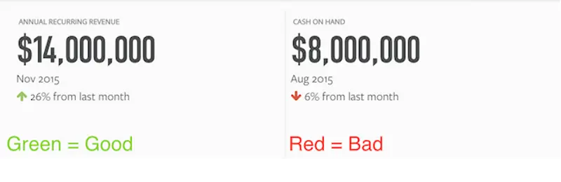
For example, try to keep your color scheme simple: let green mean good and red bad. Adding in other colors like blue for improving, or orange for declining, quickly confuses things. Similarly be wary of piecharts! If the data falls in to a few simple categories, a pie chart can be effective. However, countless studies have testified to unreadability of the thinner pieces of a pie and their inability of communicate changes over time.
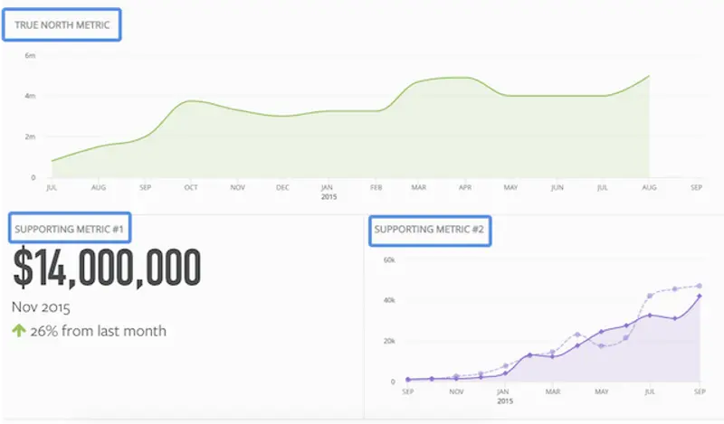
4. Make a story emerge!
It isn’t good enough to make the information available. If you want your data visualizations to be comprehensible and lead to action and change, you need to help tell a data-driven story. Begin by asking how the data will be viewed:
- What story are you trying to tell?
- Which data supports that story, and illustrates it most clearly for the end user?
- Which specific data cluster is the user going to engage with most?
For example, ensure that data is displayed in logical groups. If a dashboard includes both Financial KPIs and Sales Pipeline, make sure to position the financial data together, while the Sales Pipeline data is displayed together in a separate logical bundle.
Similarly, the most important real estate on a dashboard – the top left hand corner – is typically earmarked for a company logo or a navigation tool. Given that most Western languages will read from top to bottom, left to right, that space should be a jumping-off point for most readers. It should be prioritized for critical data.
5. Put Perfectionism Aside
Ultimately, all thoughts of a silver bullet dashboard are idealistic. No dashboard is going provide every possible answer in a single view to an evolving business. Trying to do so only ends in a knotted web of choices, alternatives, and options for the end user.
Instead, it suffices that you know your users, you keep your data uncluttered, that your design is simple, and that you tell a story. With these four broad hallmarks of good data driven dashboard design, your developing business will be ready to generate relevant insights as it grows.
Ready to build your dream business dashboard?
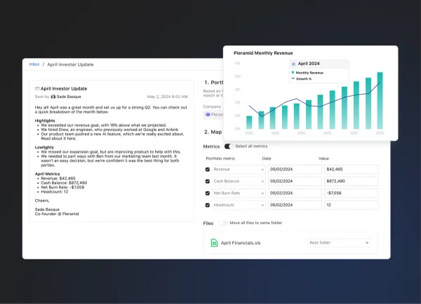
Visible is the best way to tell the unique story around your company’s data, helping you keep everyone who matters to the business engaged in the business.
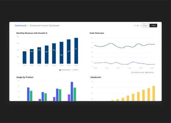
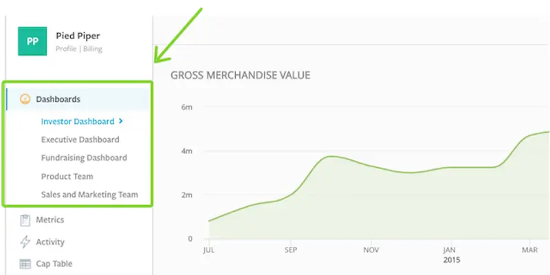
With the ability to create multiple dashboards, you can get even more granular about who you are presenting data to. Raising a new round? Build a “Potential Investors” dashboard to highlight some of your most important growth metrics. Looking to lean on industry best practices? Build a dashboard using one of our pre-made templates from firms like Andreesen Horowitz and Version One Ventures.