
Intro
User Onboarding is one of the most challenging aspects of product design. Approaching the task of how can we improve our onboarding experience can end up involving an evaluation of the entire product offering and the messaging around it (including but not restricted to all marketing material, ads & search results in google, your website, and it of course runs right through your product.)
The latest part of our user onboarding experience we recently undertook evaluating was the first run in product experience. This was our third attempt at tackling it. From our research we’ve seen that we’re not alone in the struggle to get this right. A look across the blogs of many other products will show blog posts about onboarding experiences which have since been overhauled completely. It’s clear there is no one perfect onboarding technique and a successfully onboarded user is a difficult thing to measure. From out latest effort however, we’ve seen some exciting results and we’ve got some great feedback and questions so far so we decided to share a little insight into what led us to out current solution.
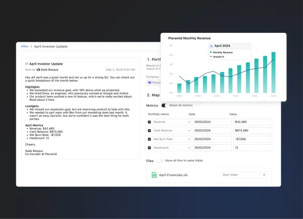
Just saw your new product update re: the contextual help guide. Great feature! Did you guys build this inhouse or use a tool to develop it?
Just read your blog post on your new help guide–I like the way you tackled that! Did you build that custom or use a product to provide contextual help?
The Problem
Our previous iterations focussed on a very particular and direct path towards what we considered to be an onboarded user within our own product. We established after which actions our users were most likely to become paying customers by looking at the statistics. We tried to then work out the shortest path to that point to create an onboarding experience that would get them to that ‘aha’ moment in one run. We tried two different approaches to this. Both with varying levels of success. It was clear that users were taking more actions within the product, but we weren’t seeing an increase in conversions to paying customers – or certainly nothing we could confidently attribute to our new onboarding experience. If anything, it was actually muddying the stats with regards to actions taken within the product because it was unclear how motivated these actions were, and whether users were seeing real value at the end of it.
We decided to take a step back and to scrap our previous concept of what we considered an onboarded user. We weren’t disregarding those main actions as a primary driver of adoption, but it was clear that the decision to convert didn’t come as easily as completing three steps and handing over the credit card details. The reasons that may cause one user to convert to a paying customer may not be the same for the next user. While their goals will be similar, there are different aspects of our product that can serve to help our users achieve them and the clinching moment for each user can be quite different.
We wanted to create a first run experience that better showcased our product and the things it can do, rather than getting our users to fulfil a specific number of actions. We also wanted to find a method that didn’t hinder the overall user experience by forcing the users down paths they may not want to go initially. We wanted to design a less intrusive onboarding experience, but one that still ensured our users didn’t get lost or give up before seeing the value of our product and came away having a very good sense of how Visible could help them achieve their goals.
Our users were converting once they’d had a chance to explore Visible, to see it’s wealth of features, it’s simplicity and ease of use and most often, for how quickly they could create data rich, beautiful updates. We were confident we could remove our previous onboarding walkthrough and we could leave users in our product with no help and almost all will figure out the main actions within our product. However, what they might not see in a first run experience is the wealth of other rich features in our product that are deliberately a little less obvious initially. The nature of our product means we have a lot of features, some complex, some simple. We wanted a way to showcase these features and offer direction for future actions, but not insist right off the bat.
The Solution
What we came up with was the Visible Help Guide. The idea was that it would be contextual and show the right information at the right time. It would be unobtrusive and only offer help when help was asked for and get out of the way when it was not needed. It would be adaptive and help each user progress in the direction they wanted to take and not through a set of predefined steps that we had decided for them.
In order for it to be contextual we ensured it was wired up to the relevant sections of our product so that when it was opened, it would first show help content relevant to that specific area of the product. If it was requested at first (we ask them how they’d like to explore Visible at the beginning), it would pop out when a user first visited an area of the product with relevant help and suggestions for that section. It would then also offer a quick overview of everything they could do from within that section and as a result gave an insight into the wealth of features available in Visible without overwhelming or insisting they complete them in a first run.
The result is a clever resource that will grow with our product and acts as a reference for everything that can be done within Visible. It offers guidance to new users to get started and prompts for next actions without insisting, and it also acts as a useful reference for more experienced users to ensure they’re getting the most out of Visible and to uncover some features that they may not have been using previously.
The response has been extremely positive. We’ve seen a 30% increase in Product Qualified leads coming through since we implemented our new guide! (Learn more about PQL’s here). We’re seeing more actions being taken within the product than our previous onboarding experiences and our users are taking these actions themselves. It’s also helped to reduce the number of requests coming into our customer support team for queries on how to perform specific actions as our users can now get help from within the app and also have an easier way to find our knowledge base in Intercom. We’re sure there will be future iterations on what we currently have but the results so far have been very positive and we finally have something to build on.